
18 Easy Tips to Make Your Website Look Professional
With the increasing number of no-coding website builders like Squarespace, many non-designers are making websites without the help of experts.
However, DIY websites have dead giveaways.
From clashing colors to design clutters, a homemade website can make your brand appear less trustworthy and turn away potential customers.
The good news is making your DIY website look professional is totally possible!
Here are simple professional website tips to help you boost the credibility of your site.

Creating a Simple Color Palette
Colors attract attention, indicate meaning, and enhance aesthetics. Colors can influence our decisions subconsciously. But when used incorrectly, nothing screams amateur websites more than colors.
Common mistakes with website colors are:
Too many colors: This can make your website look busy, unfocused, and childish.
No color: Your users will quickly become bored. Your website needs an element of pop to keep them engaged.
Clashing colors: Your website needs a mix of dominant and supporting colors. Too many strong colors will become distracting.
Lack of contrast: If you choose colors that are too similar, it will be hard to distinguish between elements and to read the content.
To create your website color palette:
Tip #1: Start with 1 main color that represents your brand personality
While color psychology is not universal, there are common feelings and meanings associated with each color.
To find your main color, first, identify how you want other people to perceive your brand. Then, look at color psychology and find a color that matches your brand personality.
Tip #2: Find 3-4 other colors that are harmonious with your brand color
Your website should use no more than 5 colors, with every color appear in multiple places throughout a page and across the website.
Your color palette may be consisted of:
1-2 brand colors. These can be used on the logo, buttons, hyperlinks, or heading texts.
1 dark color to use for texts and dark backgrounds
1 light, neutral color to use for light backgrounds
Your photos should also have similar colors to your color palette.
Tip #3: Use color generator tools
For beginners, the easiest way to find a perfect color scheme is to use color generator tools. These tools can give you harmonious color schemes based on your main color, a photo, or completely random.
Here are 3 popular free color generator tools:
Tip #4: Use a bold color for buttons
While pastel colors are soothing, they are less effective in driving actions. Deep, low-saturated colors are more stimulating for the mind, thus more inviting to click.
Tip #5: Use dark theme design with caution
Using dark backgrounds throughout the site can create a striking, dramatic look, but they come with disadvantages. Studies have shown dark text on a light background is easier to read than vice versa.
You can still use dark theme design, but keep in mind these principles:
Dark background works best with highly visual content (eg. Netflix’s black background helps movie thumbnails stand out).
Use a high contrast text color like pure white on a dark background to ensure readability.
Avoid long paragraphs on dark backgrounds.
Following Typography Guidelines
Every font has a unique personality and purpose.
A common mistake non-designers make is using fonts for incorrect purposes. For example:
Certain fonts are designed to be used as headings. When used as paragraph font, they make reading harder and decrease the chance visitors will consume your content.
Script or hand-written fonts are meant for decoration and short texts, but you can’t use them on a long sentence.
Typography is a complex topic. To simplify it, here are essential guidelines you should follow:
Tip #6: Choose 1-2 fonts
You can use one font family for all headings, and another for paragraphs, buttons, and other elements. Alternatively, you can use the same font family throughout the site but with different treatment (eg. bold, italics, capitalization) to differentiate between headings and paragraphs.
Tip #7: Vary font sizes and weights to create contrast
Different heading levels and paragraphs need to be differentiated visually to allow visitors to scan your content.
Tip #8: Paragraph fonts should be a minimum of 16px
Studies show large paragraph fonts increase reading speed and enhance comprehension when users only glance at the content. While smaller font sizes can sometimes make for a pretty look, they undermine usability and affect the overall website performance. Generally speaking, your body font size should be 16px to 20px.
Tip #9: When in doubt, choose foolproof web fonts
If choosing fonts makes your head spinning, choose neutral, readable web fonts. Some popular web fonts are: Open Sans, Montserrat, Muli, Roboto, Lato, Lora, Merriweather, Helvetica, PT Sans.
Tip #10: Use all-caps with caution
All-caps text is difficult to read and scan. You can use all-caps on short headings, decorative texts, and button labels. Don’t use it on long sentences and especially not in paragraphs.
Tip #11: Using Optimal Line Length
Line length makes a big difference in your website’s aesthetic and the likelihood people will read your content.
Have a look at the experience of reading on Wikipedia compared to NYTimes for example. The simple use of short line length makes articles on NYTimes look much easier to read and aesthetically pleasing:

Aim for a line length of 45 to 75 characters. This simple change will make your website look much more professional.
Using Photos with A Similar Style
Not only does aesthetic consistency make your design harmonious, it works at an unconscious level to influence people’s perception of your brand. Besides consistency in colors and fonts, this principle also applies to your photography.
Have a look at these two examples:
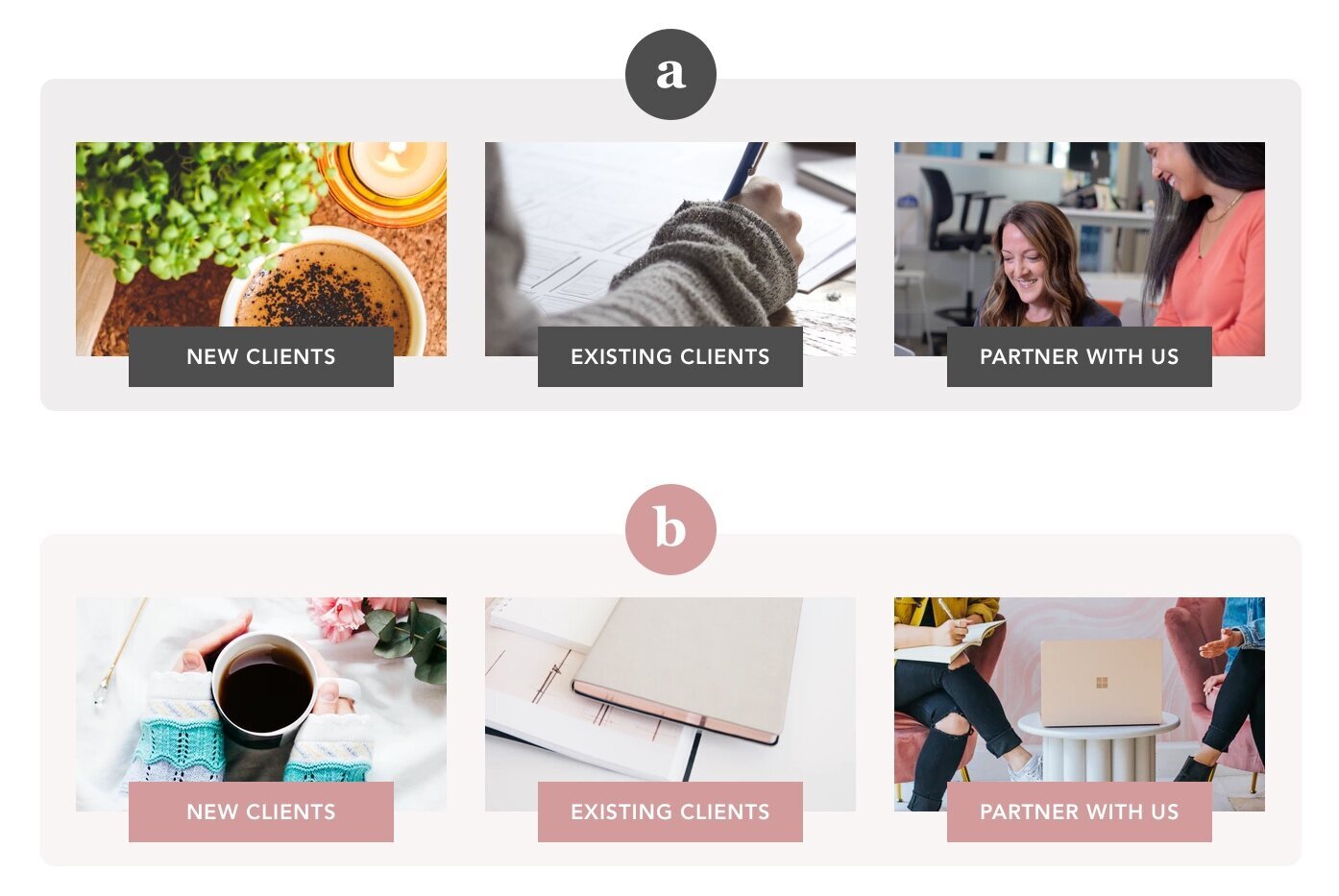
Though the image objects are roughly the same, the second option looks more attractive. That’s because it uses photos with a similar color tone. In contrast, the images from the first option seemed to belong to different brands.
This is just one section of a website. When expanding this principle to the entire website, you can see how consistent photo styles can make a big difference in brand aesthetics.

Saje website with uniform product shots
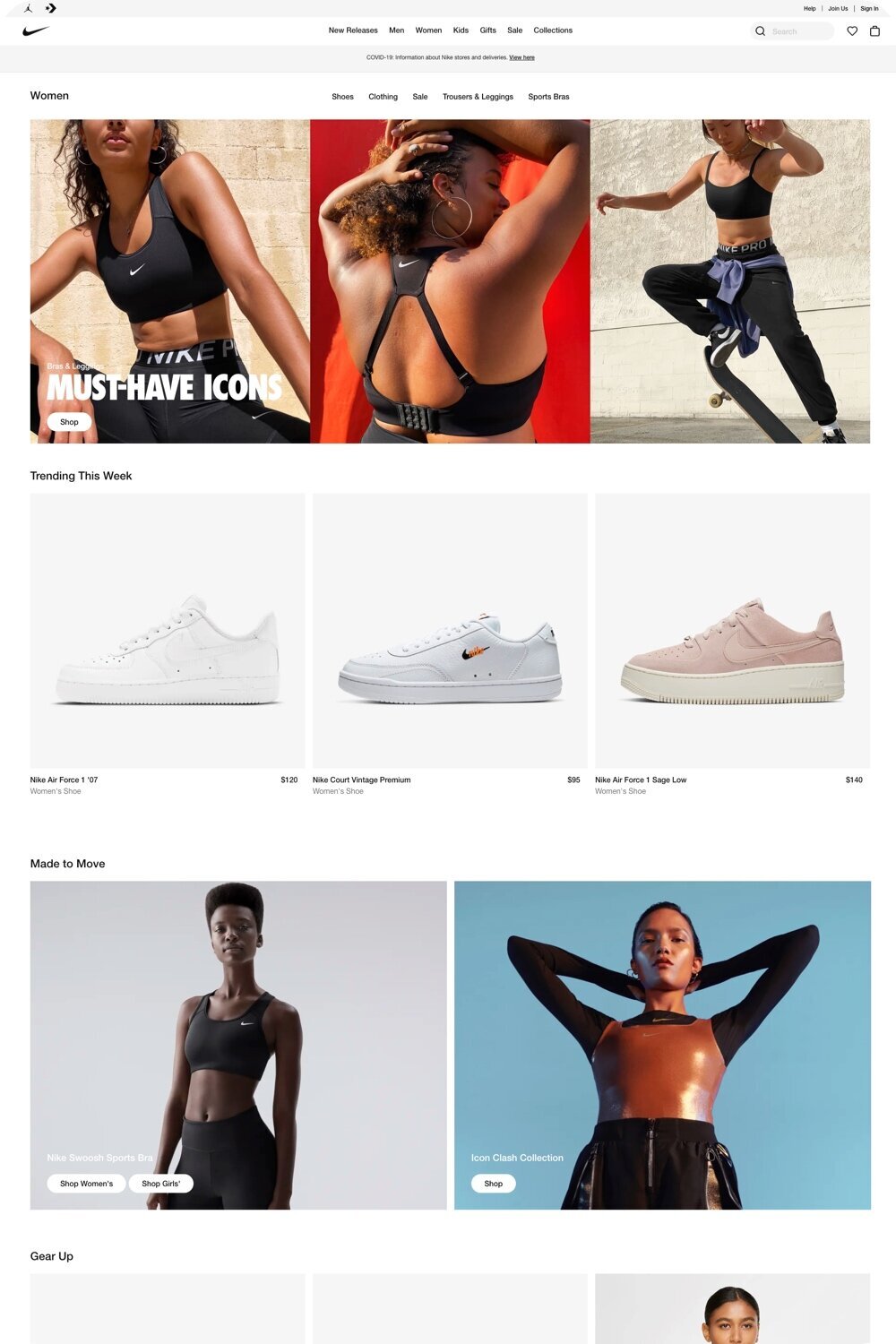
Nike website with consistent photography styles
Here are some ways to make choosing photos with the same vibe easy:
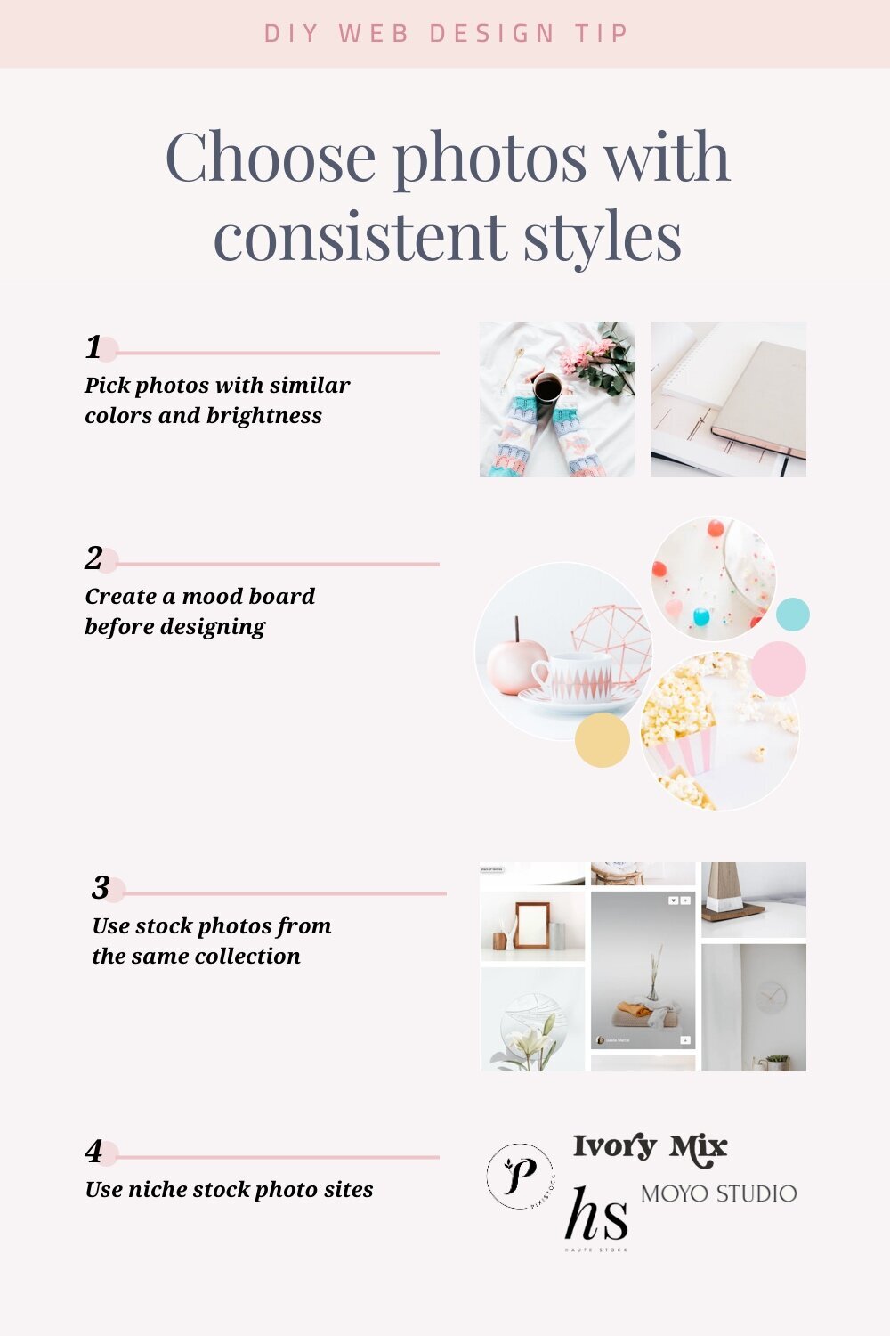
Tip #12: Choose photos with similar colors and brightness.
Pay attention to the colors and filters on photos. Photos with similar colors and/or brightness levels are almost guaranteed to look good together, even if they have other stylistic differences.
Tip #13: Create a mood board with photos you intend to use.
You can use Pinterest to create a photo collection. By placing these photos next to each other, you can see whether they will fit well together.
Tip #14: Use stock photos from the same collection.
Many stock websites like Unsplash allow you to find more photos from the same collection or photographer. These will often have the same photography style.
There are a number of stock photo websites dedicated to certain aesthetics, such as Styled Stock Society for a feminine vibe.
Aligning Elements
Alignment isn’t just a thing for OCD and perfectionists. Human brains love symmetry.
Simple fixes to make visual elements aligned can make a big difference in the website’s professionalism and attractiveness.
You may already know alignment makes a more visually appealing design. The problem is we don’t always pay attention to details.
Take a look at this example:
The element that doesn’t align immediately sticks out, even though everything else is neat and organized.
Also, there’s the issue with different screen sizes. Things can look normal on a 24-inch screen but all out of whack on a smaller screen.
So how can you make sure your website has good alignment?
Tip #15: Crop images by ratios
Instead of eyeballing images with seemingly the same size, take an additional step to make sure they’re cropped to the same ratio (4:3, 3:2, and 1:1 popular ratios).
Tip #16: Use texts with roughly the same length
When having a two or three-column layout, make sure your texts have roughly the same length. This applies to both paragraphs and button labels.
Tip #17: Center-aligned short texts
As people tend to scan texts in an F-shape pattern, it’s best to use left-alignment for any long sentences or paragraphs. However, for short texts, center alignment creates a much better symmetrical effect.
Tip #18: Remove white borders
Two same-sized photos can look like they have different sizes due to white borders. Make sure the photos you use either don’t have any border or all have the same border size.
Final Words
I hope these 18 professional website tips can help you improve your website and attract more customers. If you’re ready to take action, comment below and let me know what’s one action you will take👇
Other resources you may like:
My recommended website builder for small businesses is Squarespace - here’s why.
Not getting sales from your website? See top reasons for ineffective websites.
For a complete evaluation of your website, see how to review a website checklist.
If you’re planning on redesigning your site, check out my step-by-step web design process.